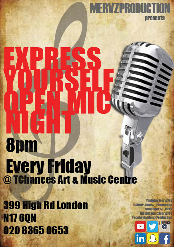
This is an image of the completed prop that me and my partner have created for this will be put on to a main focus in one of the scenes in our music video so it is crucial that we create a flyer that will not only go with the theme of our music video but also it looking professional for this will make our music video look more professional. There was many changes we made from our previous leaflet from a couple of days ago, the main changes we made was the font instead of using Castellar for the name of the producer and of addition information we used Hattenscweiler the reason to why we used this font was because this font was very common for many flyers when we were researching previous and existing flyers so we used those as an example while creating our flyer.
The theme colour for our flyer was RED,BLACK AND GREY
We used a website that helped us chose a sensible colour scheme for our leaflet as the webiste provided us a chart of psychology for colours becuase as media students we understand everything included in a moving art symbolises something so it was important to use this within our flyer.
Source: http://d2dc.co.uk/why-colour-matters-in-leaflet-design/


Great reading and extremely comprehensive post – pretty much covers everything...
ReplyDeletehttps://pbleafletdistribution.co.uk/